Metrics Dashboard
The Metrics Dashboard is the primary KPI surface in Canopy NOC. It displays all key performance indicators computed by enabled analysis algorithms for your selected network, organized by the platform’s problem taxonomy. Use this view to understand current network health at a glance, identify firing alarms, inspect metric history, and navigate to related alarms and map features.
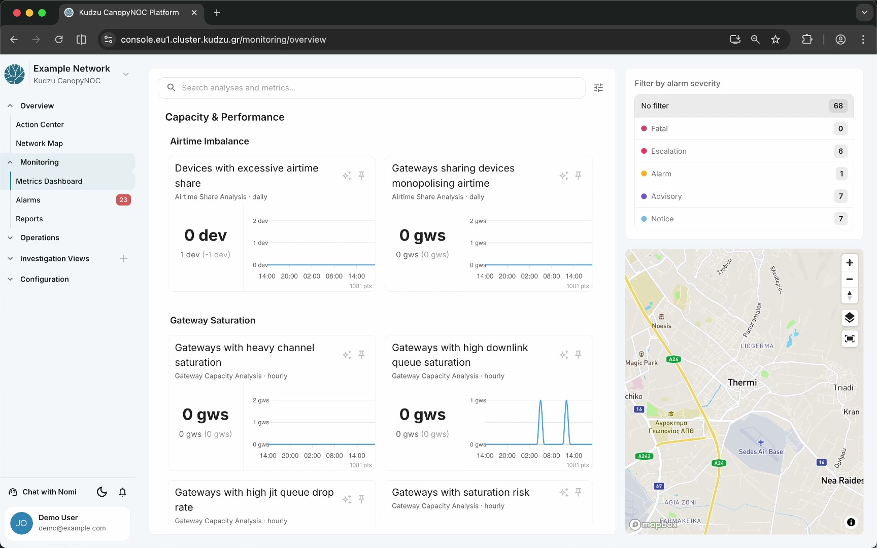
Key areas#
- Search and metrics panel (center) — a vertically scrollable list of metric cards grouped by problem-tree categories, with a search bar and settings button at the top.
- Severity filter sidebar (right) — filter buttons for alarm severity levels, each showing a count of metrics in that state.
- Map panel (right) — a mini-map that highlights geographic features associated with the currently focused metrics.
How to use this view#
Read metric cards#
Each metric card displays:
- Metric name — the human-readable title (e.g., “Devices with excessive airtime share”).
- Analysis label — the algorithm and run cadence producing the metric (e.g., “Airtime Share Analysis - daily”).
- Current value — the absolute value with unit (e.g., “21 gws”).
- Delta indicator — the previous value and change amount in parentheses.
- 24-hour sparkline — a time-series chart of recent values.
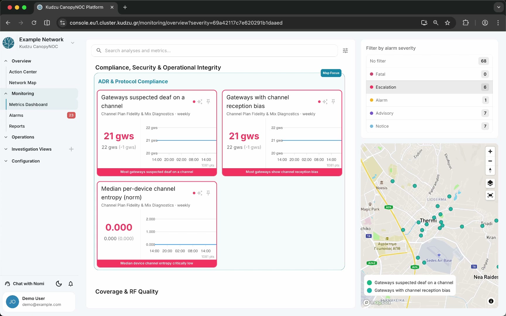
- Alarm bar — when an alarm is active, a colored bar with a short description appears at the bottom. The card border and value text match the alarm severity color.

Use hover and map focus#
Hovering over a metric card, algorithm section, or category heading automatically focuses the map panel on the geographic features associated with that scope. The map legend updates to show which entity types are displayed. As you scroll and move the cursor, the map continuously follows.
Lock map focus#
Click a category or problem section title to lock the map on that scope. A “Map focus locked” label replaces “Map focus,” and a small X button appears. The map remains focused on the locked scope regardless of cursor movement until you click the X to unlock.
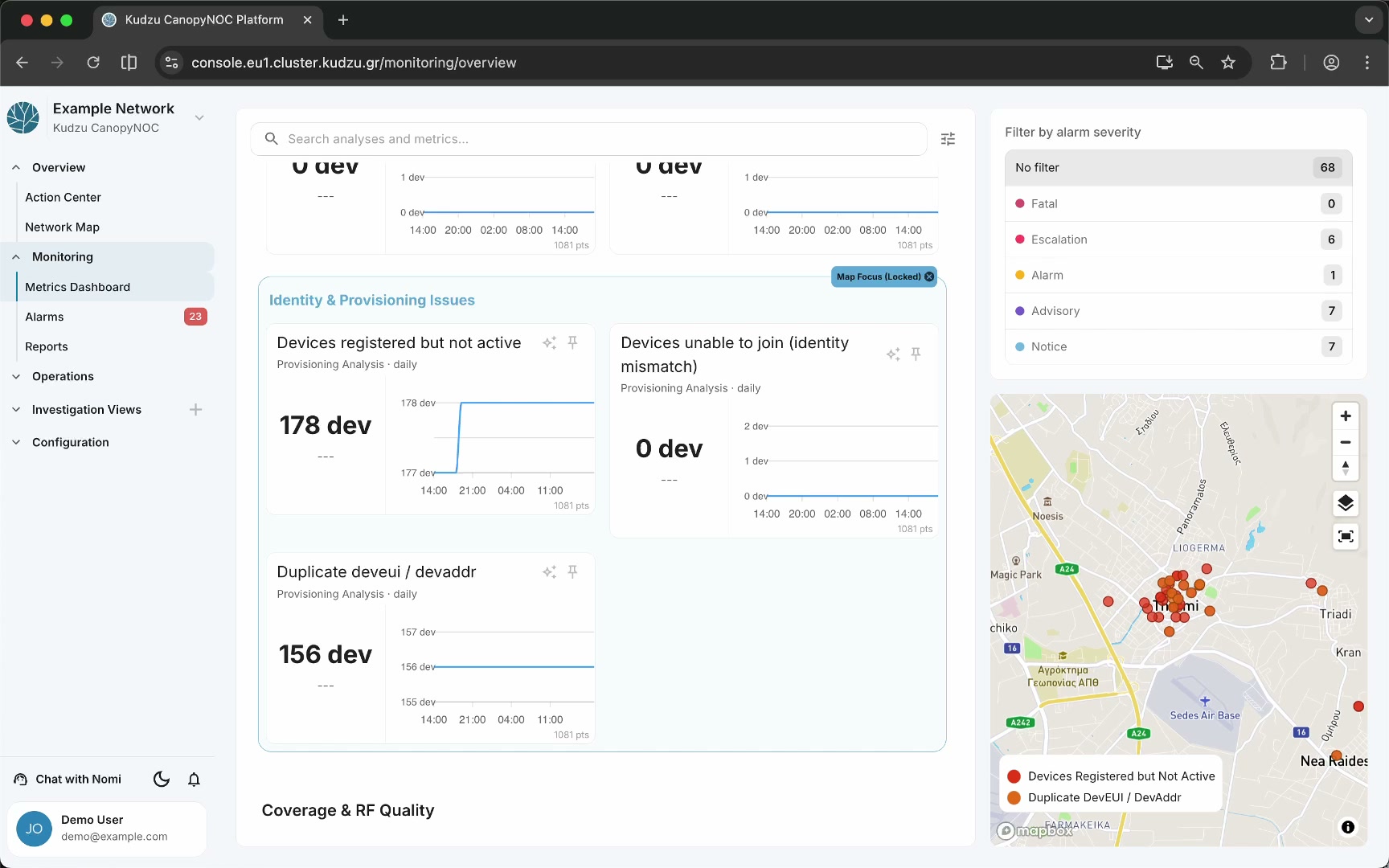
Filter by alarm severity#
The severity filter panel on the right shows these levels:
| Level | Description |
|---|---|
| No filter | Shows all metrics |
| Fatal | Highest severity |
| Escalation | Elevated severity |
| Alarm | Standard alarm level |
| Advisory | Informational warning |
| Notice | Lowest severity |
Click a severity level to show only metrics currently firing at that severity.
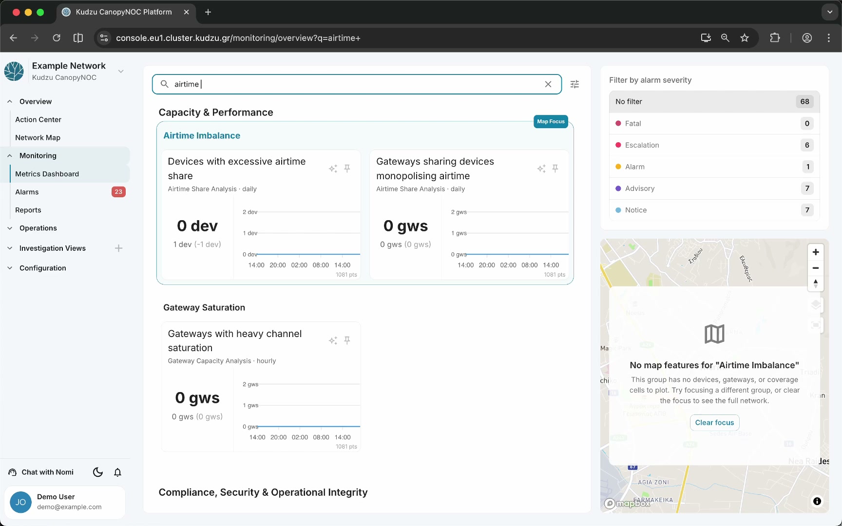
Search for metrics#
Type in the search bar labeled “Search analyses and metrics…” to filter displayed metrics to those whose names match the search expression.
Pin favorites#
Click the pin icon on any metric card to add it to the Favorites section at the top of the panel. Favorited metrics stay visible at the top of the dashboard for quick access and trigger map focus on hover like any other metric.
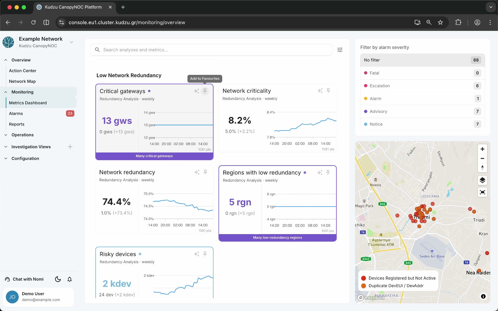
Switch to relative values#
Click the settings gear icon next to the search bar to toggle between absolute and relative metric values. In relative mode, count-based metrics display as a percentage of the total resource count (e.g., “59%” instead of “1 gw”).
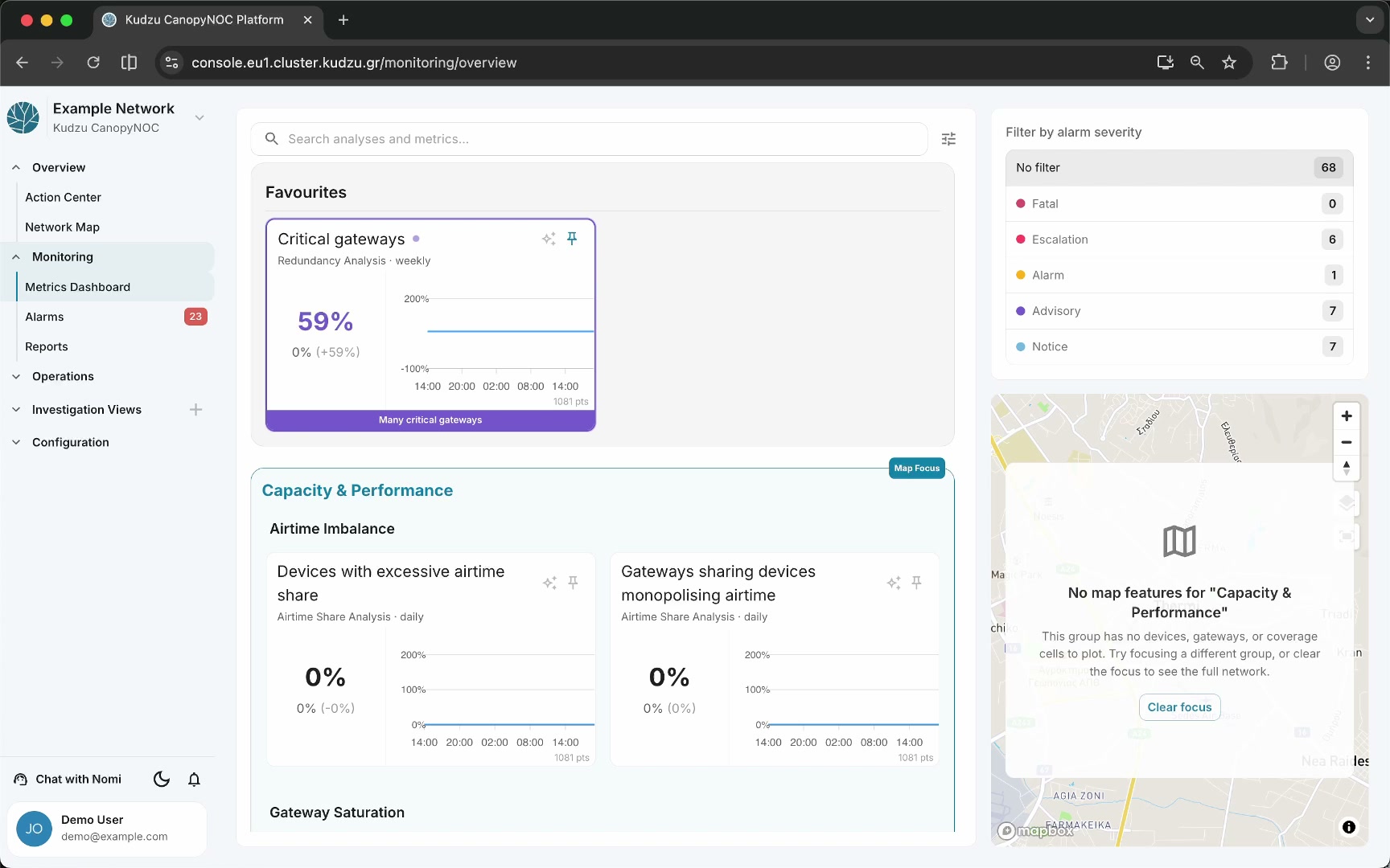
Open KPI detail#
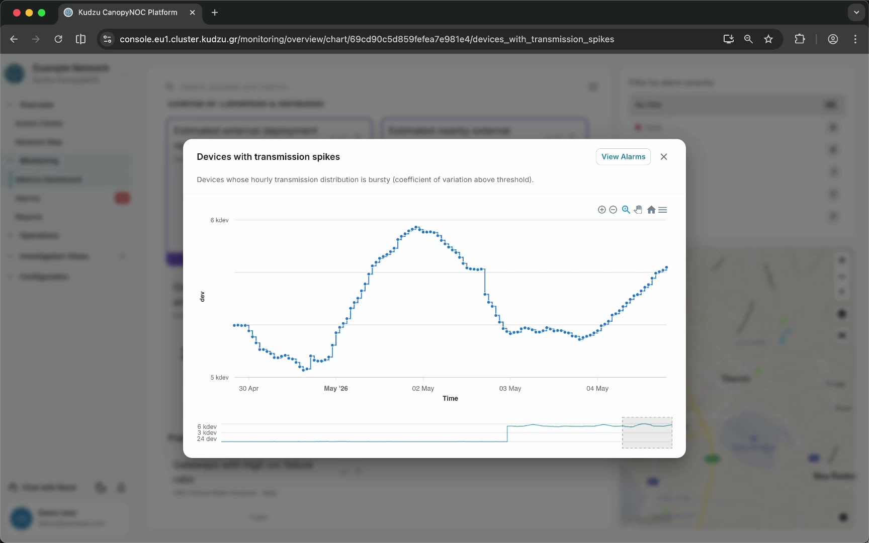
Click a metric card to open a detail dialog with:
- A longer historical time-series chart spanning multiple days
- Chart toolbar with zoom, pan, download, fullscreen, and home buttons
- A scrubber for selecting a time window
- A View Alarms button that navigates to the Alarms detail view for the metric
Get AI insights#
Click the sparkle icon on a metric card to open the Nomi chatbot pre-focused on that metric for targeted analysis and guidance.