LoRa Uplink Analysis
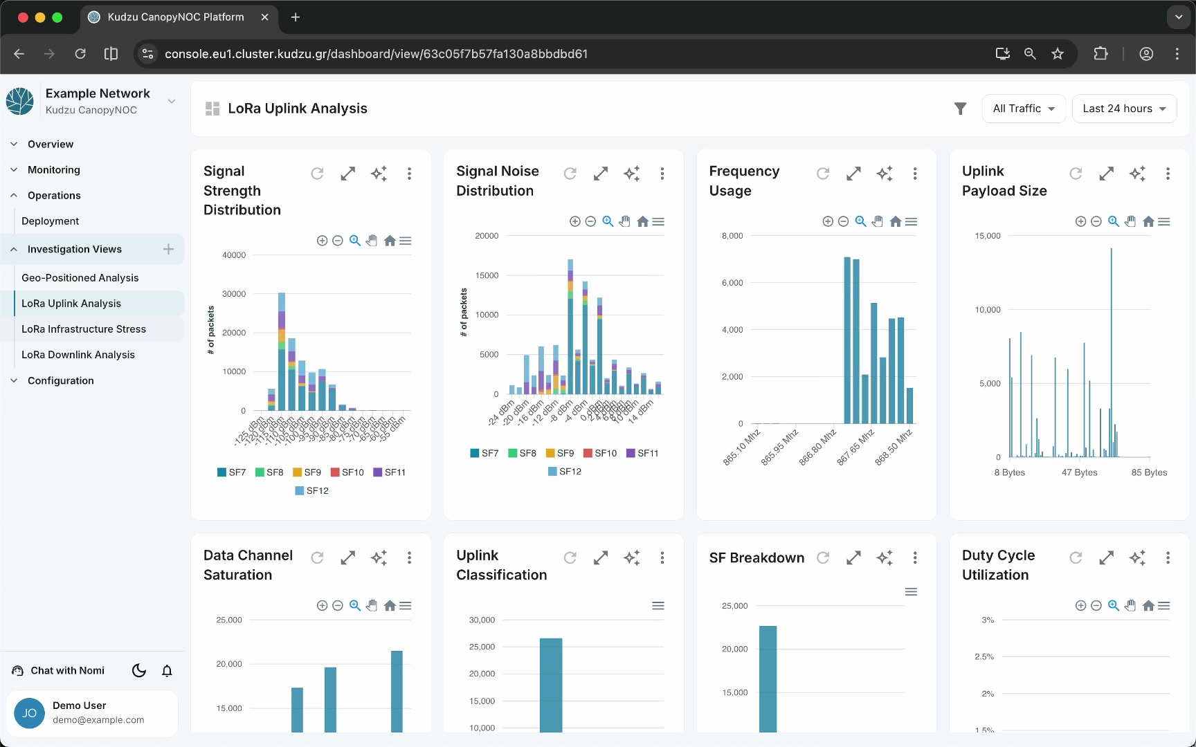
The LoRa Uplink Analysis view provides a diagnostic breakdown of uplink communication across your LoRaWAN network. Use it to inspect signal strength distributions, noise levels, frequency usage, payload sizes, channel saturation, and duty cycle compliance. The dashboard helps you spot RF issues, identify spreading-factor imbalances, and verify that your network operates within regulatory limits.
Widgets#
| Widget | Chart type | Description |
|---|---|---|
| Signal Strength Distribution | Bar chart | Distribution of received signal strength (RSSI) across dBm ranges, broken down by spreading factor (SF7–SF12) |
| Signal Noise Distribution | Bar chart | Distribution of signal-to-noise ratio (SNR), broken down by spreading factor |
| Frequency Usage | Bar chart | Packet counts per frequency channel |
| Uplink Payload Size | Bar chart | Distribution of uplink payload sizes |
| Data Channel Saturation | Line/bar chart | Channel saturation levels over time |
| Uplink Classification | Bar chart | Breakdown of uplink packet types (join requests, confirmed, unconfirmed) |
| SF Breakdown | Bar chart | Packet counts by spreading factor |
| Duty Cycle Utilization | Line chart | Duty cycle usage percentage over time |
How to use this view#
- Open LoRa Uplink Analysis from the sidebar under Investigation Views.
- Set the time window to the period you want to investigate. Start with Last 24 hours for recent issues or Last 1 week for trend analysis.
- Use the traffic source filter to isolate your own device traffic or to inspect external noise separately.
- Check Signal Strength Distribution first to identify whether devices cluster in weak-signal RSSI ranges.
- Cross-reference with Signal Noise Distribution to determine if poor SNR correlates with specific spreading factors.
- Review Frequency Usage and Data Channel Saturation to detect congested channels.
- Monitor Duty Cycle Utilization to verify regulatory compliance and identify periods approaching the duty cycle limit.
- Use Uplink Classification to understand the mix of confirmed versus unconfirmed traffic and join request volume.
Understanding the data#
Signal Strength Distribution#
The RSSI bar chart groups received packets into dBm buckets, with each bar segmented by spreading factor. A healthy network shows most packets in the –90 to –110 dBm range. If a large share of packets falls below –120 dBm, devices are likely at the edge of reception and may benefit from closer gateway placement.
Signal Noise Distribution#
SNR values indicate how clearly the signal stands out from background noise. Positive values represent clean reception. Packets at negative SNR values, especially at higher spreading factors, suggest that devices are struggling to maintain a link.
Frequency Usage#
This chart reveals how evenly packets distribute across available channels. Uneven distribution may indicate channel congestion or device firmware that does not implement proper channel hopping.
Uplink Payload Size#
Payload size distribution helps you understand application-level behavior. Unexpected spikes in large payloads can increase airtime and duty cycle consumption.
Data Channel Saturation#
Track channel saturation over time to identify periods when your network approaches capacity limits. Sustained high saturation may require additional gateways or a review of device transmission schedules.
Duty Cycle Utilization#
Duty cycle usage must stay within regional regulatory limits (typically 1% in the EU868 band). This line chart shows utilization percentage over time. Approaching the limit indicates that the network is under heavy load.
Uplink Classification and SF Breakdown#
These charts together show the nature of your uplink traffic. A high proportion of join requests may signal device connectivity problems. SF Breakdown reveals whether devices are predominantly using higher spreading factors, which consume more airtime.
Related pages#
- Investigation Views — overview of all investigation dashboards and global filters
- LoRa Infrastructure Stress — operational stress and redundancy indicators
- LoRa Downlink Analysis — downlink traffic and power distribution
- Geo-Positioned Analysis — map-based spatial diagnostics