LoRa Infrastructure Stress
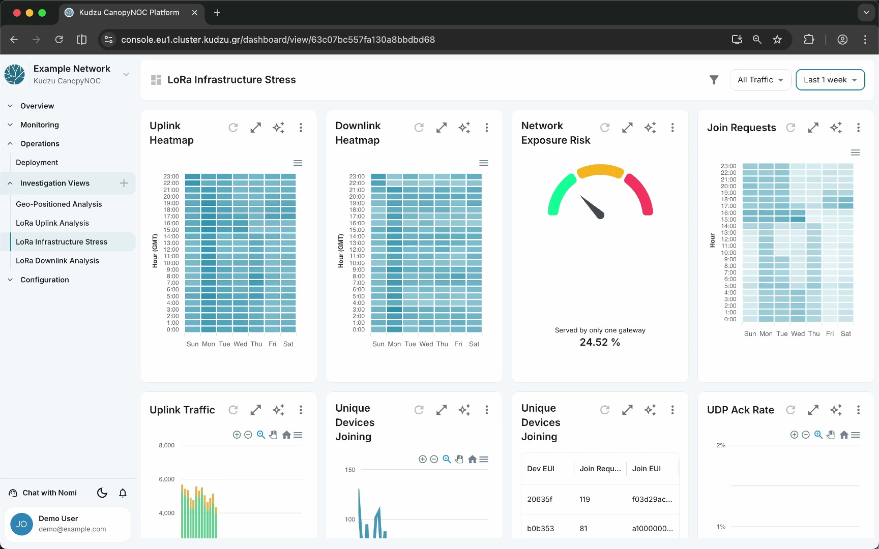
The LoRa Infrastructure Stress view focuses on infrastructure load, redundancy, and operational risk across your LoRaWAN network. It uses heat maps to reveal activity patterns by day and hour, a gauge to surface single-gateway exposure risk, and tables to track device join behavior. Use this dashboard to detect peak-load periods, verify gateway redundancy, and investigate abnormal join request patterns.
Widgets#
| Widget | Chart type | Description |
|---|---|---|
| Uplink Heatmap | Heat map | Hour × day-of-week intensity grid showing uplink activity patterns. The x-axis shows days (Sun–Sat) and the y-axis shows hours (0:00–23:00). |
| Downlink Heatmap | Heat map | Hour × day-of-week intensity grid showing downlink activity patterns |
| Network Exposure Risk | Gauge | Single-value indicator showing the percentage of devices served by only one gateway |
| Join Requests | Heat map | Hour × day-of-week intensity grid for join request activity |
| Uplink Traffic | Bar chart | Uplink packet count over time |
| Unique Devices Joining | Bar chart + Table | Count of unique devices joining over time, with a detail table listing individual devices by Dev EUI, join request count, and Join EUI |
| UDP Ack Rate | Line chart | Gateway UDP acknowledgment rate percentage over time |
How to use this view#
- Open LoRa Infrastructure Stress from the sidebar under Investigation Views.
- Set the time window to at least one week to get meaningful heatmap patterns.
- Examine the Uplink Heatmap and Downlink Heatmap to identify peak-activity hours and days. Dark cells indicate high traffic.
- Check the Network Exposure Risk gauge. A high percentage means many devices rely on a single gateway — a failure of that gateway would cause service loss for those devices.
- Review the Join Requests heatmap to spot unusual join activity clusters. Persistent join request spikes at specific hours may indicate device connectivity instability.
- Use Unique Devices Joining to track how many new devices attempt to join. The detail table lets you identify specific devices by Dev EUI.
- Monitor the UDP Ack Rate to verify that gateways are reliably acknowledging server messages. A declining rate may indicate connectivity issues between gateways and the network server.
Understanding the data#
Uplink and Downlink Heatmaps#
The heatmaps show traffic intensity on a weekly grid. Each cell represents one hour of one day. Consistent dark bands at specific hours reveal predictable peak-load periods. Uneven downlink patterns compared to uplinks may indicate scheduling inefficiencies or queued MAC commands.
Network Exposure Risk#
This gauge reports the percentage of devices that only one gateway can reach. In a well-designed network, most devices should be covered by at least two gateways to provide redundancy. A high exposure risk percentage indicates areas where a single gateway failure would cause a coverage gap.
Join Requests#
Join request heatmap patterns differ from regular traffic patterns because joins are event-driven. A uniform spread suggests healthy periodic rejoins. Intense clusters may signal power-cycling devices, OTAA key issues, or network instability causing mass rejoin storms.
Uplink Traffic#
The bar chart shows total uplink volume over time. Use it alongside the heatmaps to correlate overall traffic trends with hourly patterns.
Unique Devices Joining#
This widget combines a time-series bar chart with a tabular breakdown. The table lists each device’s Dev EUI, join request count, and Join EUI, making it straightforward to identify devices that rejoin excessively.
UDP Ack Rate#
A healthy network maintains a high UDP acknowledgment rate. A sustained decline may point to network connectivity issues between gateways and the LNS, packet loss on the backhaul, or gateway firmware problems.
Related pages#
- Investigation Views — overview of all investigation dashboards and global filters
- LoRa Uplink Analysis — detailed uplink signal and traffic charts
- LoRa Downlink Analysis — downlink traffic and power distribution
- Geo-Positioned Analysis — map-based spatial diagnostics