Geo-Positioned Analysis
The Geo-Positioned Analysis view renders network data spatially on an interactive map. Instead of traditional charts, this dashboard uses hexagonal cells and point markers to show where activity and signal quality patterns are concentrated geographically. Use it to identify coverage gaps, interference hotspots, and areas where device onboarding clusters.
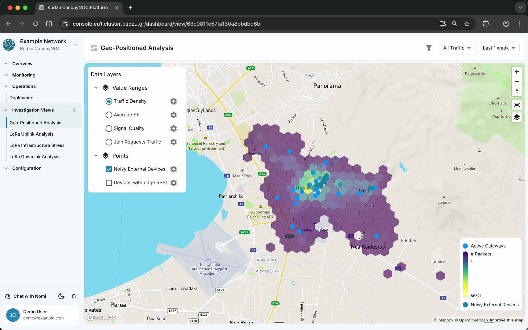
Key areas#
- Map canvas — the main area displaying hexagonal grid cells, gateway markers, and device point markers overlaid on a geographic map.
- Data Layers panel — a sidebar panel on the left that controls which layers are visible on the map.
- Map legend — located in the bottom-right corner, showing Active Gateways (blue dots), a packet count gradient, and Noisy External Devices (green dots).
Data layers#
The Data Layers panel provides two groups of toggleable layers:
Value ranges#
Select one layer at a time using radio buttons:
| Layer | What it shows |
|---|---|
| Traffic Density | Hexagonal cells colored by packet count, revealing where traffic concentrates |
| Average SF | Average spreading factor per cell, highlighting areas where devices use higher SF values (indicating weaker coverage) |
| Signal Quality | Aggregated signal quality per cell, helping you spot regions with degraded reception |
| Join Requests Traffic | Join request density per cell, useful for locating areas with frequent device onboarding or rejoin storms |
Points#
Toggle multiple point layers simultaneously using checkboxes:
| Layer | What it shows |
|---|---|
| Noisy External Devices | Locations of external devices whose traffic is picked up by your gateways, indicating potential interference sources |
| Devices with edge RSSI | Devices operating near the RSSI reception threshold, flagging candidates for coverage improvement |
Each layer has a settings gear icon for additional configuration options.
How to use this view#
- Open Geo-Positioned Analysis from the sidebar under Investigation Views.
- Set the time window and traffic source filter to match the period and data scope you want to investigate.
- Start with Traffic Density selected in the Value Ranges group to get a high-level picture of where your network is active.
- Switch to Average SF or Signal Quality to correlate high-traffic areas with RF performance.
- Enable the Noisy External Devices point layer to overlay interference sources on the same map.
- Enable Devices with edge RSSI to identify devices that may benefit from a closer gateway or antenna adjustment.
- Use the map legend to interpret color gradients and marker types.
Understanding the data#
| Layer | Visualization | Interpretation |
|---|---|---|
| Traffic Density | Hexagonal cells, color gradient | Darker cells indicate higher packet volume. Look for unexpected cold spots that may signal coverage gaps. |
| Average SF | Hexagonal cells, color gradient | Higher average SF values suggest devices are compensating for weaker signal with longer airtime. |
| Signal Quality | Hexagonal cells, color gradient | Low-quality cells may indicate interference, obstructions, or insufficient gateway density. |
| Join Requests Traffic | Hexagonal cells, color gradient | Clusters of join requests can reveal areas with unstable connectivity causing frequent rejoins. |
| Noisy External Devices | Green point markers | External devices picked up by your gateways. High density may contribute to duty cycle pressure and interference. |
| Devices with edge RSSI | Point markers | Devices near the reception limit. Prioritize these locations when planning coverage improvements. |
Related pages#
- Investigation Views — overview of all investigation dashboards and global filters
- LoRa Uplink Analysis — uplink signal and traffic charts
- LoRa Infrastructure Stress — infrastructure load and risk indicators