Investigation Views
Investigation Views are widget-based diagnostic dashboards that visualize raw network data as collected from your LoRaWAN infrastructure. Use them for ad-hoc investigation of signal strength distributions, frequency usage, payload sizes, uplink/downlink activity patterns, geographic data overlays, and more. Unlike the Metrics Dashboard which surfaces computed KPIs and alarm states, Investigation Views present aggregated raw data through interactive charts, tables, gauges, heat maps, and map visualizations.
Predefined views#
The platform ships with several predefined investigation dashboards:
| View | Purpose |
|---|---|
| Geo-Positioned Analysis | Map-based visualization of traffic density, average spreading factor, signal quality, and join request patterns |
| LoRa Uplink Analysis | Charts covering uplink-specific measurements — RSSI, SNR, frequency usage, payload sizes, duty cycle |
| LoRa Infrastructure Stress | Operational stress indicators — heatmaps, exposure risk gauges, join request patterns, device joining activity |
| LoRa Downlink Analysis | Charts covering downlink-specific measurements — Tx power, antenna usage, band usage, payload sizes |
You can import additional dashboards from the platform’s dashboard catalog at any time.
Adding a new view#
To install an investigation view that is not yet in your sidebar:
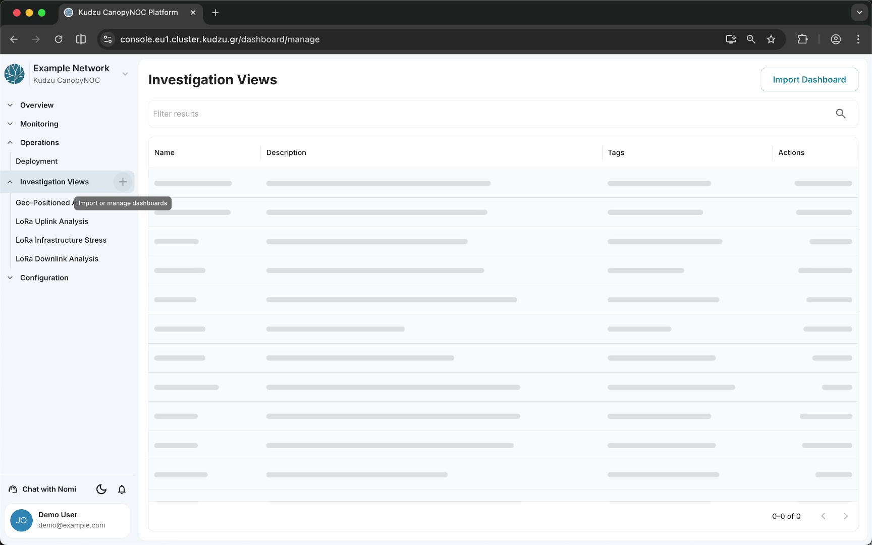
- Click the + icon next to the Investigation Views label in the sidebar. This opens the management page.
- The management page lists currently installed views with columns for Name, Description, Tags, and Actions.
- Click Import Dashboard in the top-right corner.
- A dialog opens listing available dashboards. Use the Filter results search bar to narrow the list.
- Select the dashboard you want and click Select.
- The newly imported dashboard appears in both the sidebar and the management table.
Each installed view in the management table has action buttons for settings, editing, and deletion.
Dashboard layout#
Every investigation view is a full-page grid of widget cards. The page header shows the dashboard title and two global filter dropdowns in the top-right corner.
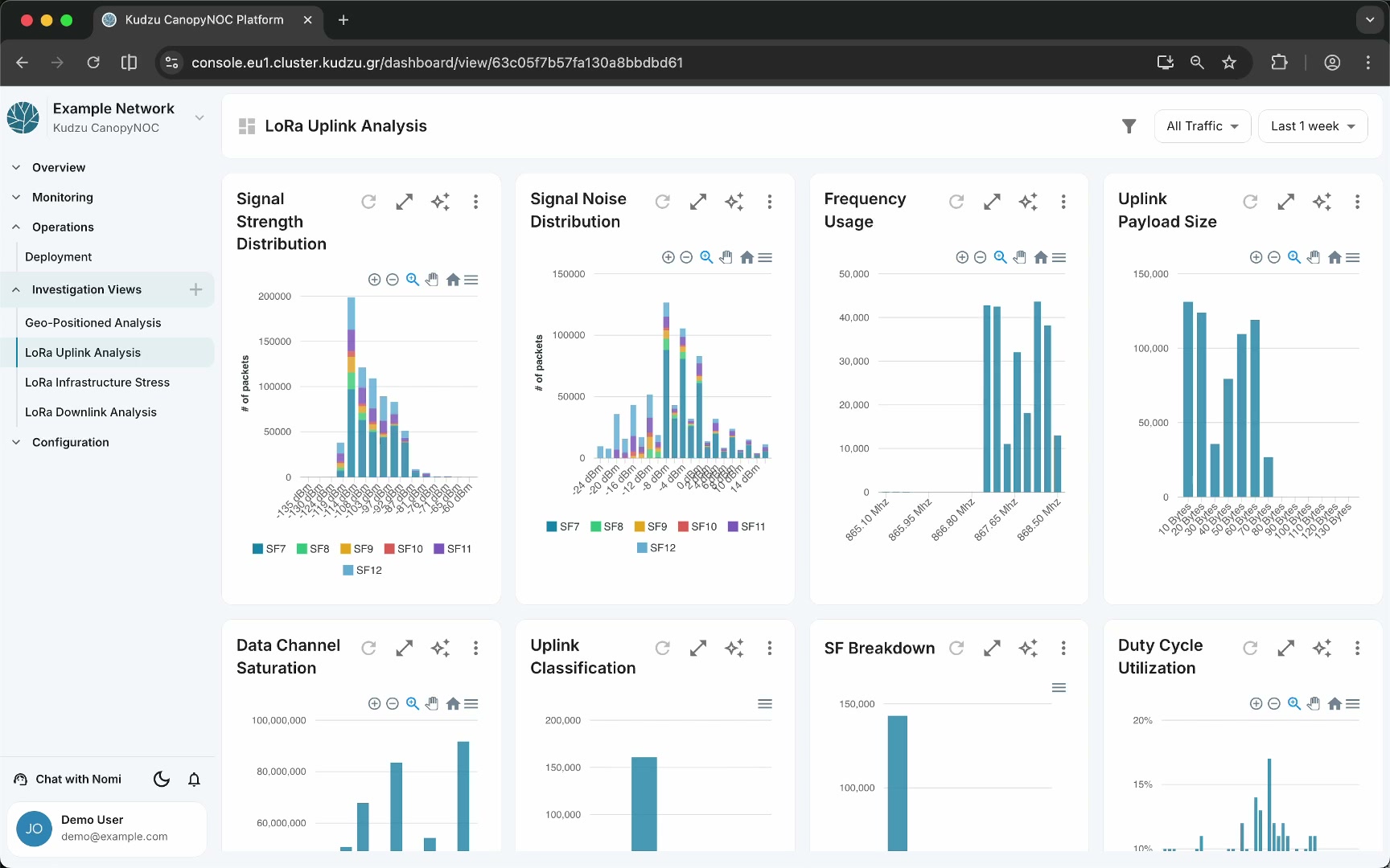
Each widget card includes:
- Widget title — the name of the chart or visualization (for example, “Signal Strength Distribution”).
- Toolbar buttons — refresh, edit (pen icon), expand to full screen, pin/favorite (star icon), and a three-dot menu for additional options.
- Chart interaction controls — depending on the chart type: zoom in/out, pan, search, home/reset, and a hamburger menu for chart-specific settings.
Global filters#
Two dropdowns at the top of every dashboard control which data all widgets display.
Time window selector#
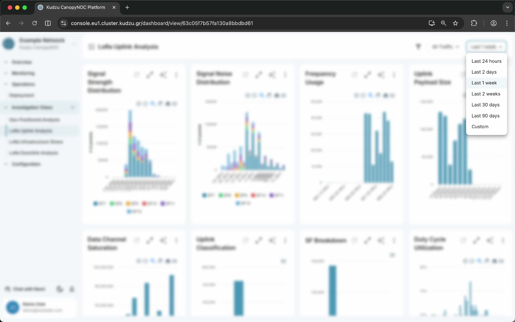
The time window dropdown sets the time range for every widget on the dashboard simultaneously. Predefined options include:
- Last 24 hours
- Last 2 days
- Last 1 week
- Last 2 weeks
- Last 30 days
- Last 90 days
- Custom — select a specific start and end time
Changing the time window is useful for observing how network events evolve across different time scales.
Traffic source filter#
The traffic source dropdown filters data by origin:
| Option | Description |
|---|---|
| All Traffic | Data from all sources |
| Only Internal | Traffic from your own devices only |
| Only External | Traffic from external or foreign devices observed by your gateways |
This filter is relevant when your integration receives raw gateway traffic (for example, through ChirpStack or The Things Stack), which can distinguish between your own device traffic and external traffic from neighboring LoRaWAN deployments. Filtering to external-only traffic helps you identify noisy surroundings and diagnose interference.
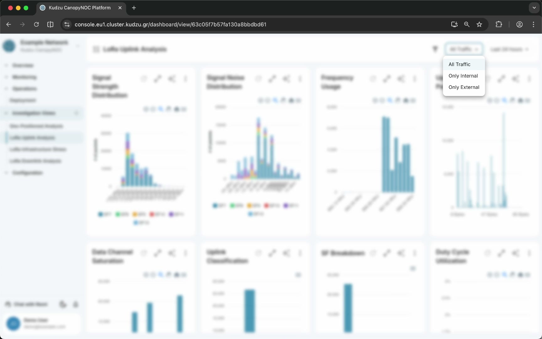
Chart types#
Investigation dashboards use several visualization types depending on the data:
| Type | Used for |
|---|---|
| Bar charts | Distributions such as signal strength by dBm bucket, frequency usage, payload sizes |
| Line charts | Time-series data such as uplink traffic or duty cycle utilization over time |
| Gauges | Single-value risk indicators such as “Network Exposure Risk” |
| Heat maps | Day-of-week × hour-of-day activity grids showing traffic intensity across the week |
| Tables | Tabular data such as unique devices joining, with Dev EUI, join request counts, and Join EUI columns |
| Map visualizations | Spatial data rendered with hexagonal cells, point markers, and value-range layers |
Related pages#
- Geo-Positioned Analysis — map-based spatial diagnostics
- LoRa Uplink Analysis — uplink signal and traffic charts
- LoRa Infrastructure Stress — infrastructure load and risk indicators
- LoRa Downlink Analysis — downlink traffic and power charts